
Thank you for voting! You can see the results in the poll box.
This art book published by Titan Books will highlight 30 years of my career. It will premier at the San Diego Comic Con in July. More exciting news to share soon.
COVER #1 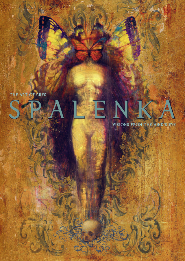


COVER #2

 Please ignore any advertisements that you see below. They are placed there beyond my control at the moment.


I like the head with the eye!
Cool, Bev.
they are both gorgeous, of course. but because of the title, i vote for the second one. visually logical. imho 😉
Sweet.
Me too – I love them both, but the second one seems the most apropos given the title.
Excellent. Thank you for the feedback.
The second one, it is mesmerizing!
Thanks Donna!
Hi Greg 🙂 I have followed your beautiful and inspiring artworks for many moons now and love them all! However in this vote, I am drawn to Cover #2 which I find mesmerising 😉 ❤
I think I am in the minority! I do love the second one for all the reasons above, but the first one just has more metaphorical layering to me, which encompasses so much about your work, so I like it better.
Thank you Lisa!
I associate the one with the butterfly with Greg’s art (because Bob and I have one of Greg’s butterflies!) Also, I think the other image is too literal of the title, while it still implied in the butterfly image. Thanks for letting me have input – I’m vested now!
Yes, butterfly energy is a strong one. Thank you for voting.
2nd one for sure!
The top one gets my nod! Both are beautiful!
I think the type in the second cover works the best because it is the most readable. I think if you can somehow work that into the first cover, you’d have a real winner. They both look great though. The first cover reads much more like a “spalenka”.
i love both but… the butterfly wins 🙂
Both are striking, but I’m drawn to the top one also.
both are pretty brilliant but the second one zings! i was immediately drawn in. excited to get the book when it comes out!
They are both gorgeous, and I was initially more drawn to the second one, which seems more striking – but on looking again I really love the symbolism in the first one, with death at the feet and transformation at the head. So the first one invites deeper reflection and the second is more initially arresting for me – that might be the one that attracts more customers. Congratulations on your book!
Hey Greg. I didn’t know you were into art 🙂 You thought you could play racquetball too though. If I remember correctly. Seriously, though, the first leaves more for me to think about. I love the mystery of it. Of course they’re both beautiful and have Spalenka all over them, hence, the beauty. Who’s the type setting guy. Do I know him. Smells familiar…
Hi Greg,
Good to hear from you! It has been a long time my friend. Thank you for your thoughts on the cover, and in fact your choice is the piece that will be on the cover. Jeff has been stellar throughout designing the book. I am an honored to have him work on it and even more blessed to have him as my friend. Be well!